Client Overview: The Spartanburg YMCA, like YMCAs nationwide, serves as a well-known fitness and community activity center, offering programs for individuals of all ages, including fitness classes, youth programs, and family activities. Their focus is on promoting health, wellness, and community engagement.

Their Digital Goals
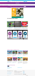
The YMCA needed a complete website overhaul to modernize their digital presence. Their previous site was outdated, difficult to navigate, and not optimized for mobile devices, which negatively impacted user experience. The goals included creating a more cohesive structure, improving the site’s mobile responsiveness, and ensuring that information about programs and schedules was easily accessible to their diverse user base.
Challenges: While the YMCA website was built in WordPress, the system was locked into ReClick’s restrictive backend. Using creative solutions, we overcame the restrictions and still delivered a highly improved website.
Building Their Solution
Step 1 - Website Redesign
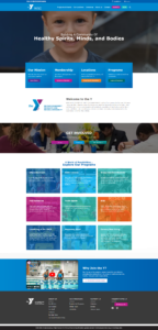
We utilized Elementor within the existing ReClick system that all YMCAs use. Due to ReClick’s limitations, we couldn’t add plugins or additional functionalities, so we had to rely on creative CSS and Elementor-specific customizations. This approach allowed us to build a modern, user-friendly design, improve accessibility, and ensure a cohesive look and feel across the website.


Technical SEO and Content Optimization: A key focus during the website rebuild was on enhancing the site’s technical SEO. By strategically placing keywords and revising content formatting, we significantly improved the site’s visibility and performance on search engines.
Step 2 - Mobile Optimization and Usability
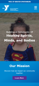
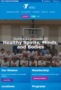
Given the high traffic from mobile users, we focused on delivering a fully responsive design. Our CSS adjustments and design choices prioritized mobile usability, making navigation simpler and improving load times on all devices, especially mobile.
Step 3 -Content Reformatting
We restructured the website’s content to create a logical flow, helping users quickly locate information on classes, schedules, and membership options. The goal was to provide clarity in navigation, allowing users to engage with the site’s resources without unnecessary clicks.
The Results
Enhanced User Experience: The updated website is now fully mobile-responsive, fast, and easier to navigate. Feedback from users has been overwhelmingly positive, noting improvements in accessibility and ease of finding information.
Operational Efficiency: The YMCA staff now finds it easier to update and manage content, thanks to the simplified backend structure we developed with Elementor.
Improved Community Engagement: The site’s redesign reflects the YMCA’s community-focused mission, making it easier for members to stay informed about programs, events, and offerings.
Conclusion:
Through strategic design improvements and creative problem-solving within system limitations, we elevated the YMCA’s web presence, making it an accessible, modern platform that supports their community mission and keeps them on par with digital standards among other YMCAs.


